
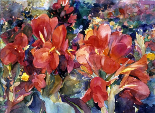

Cantata © by Ellen Jean Diederich – Red is the dominate color supported in a cool palette.
Developing balance in the relationship between colors is the key to good color. Think about a group of people in an organization—one is a leader—the group has power as they are “associated” in support of the same goal. There are always some key players and a committee working toward the completion of a project. When you choose a dominant color it is like the president of the painting and the committee is the palette that supports him. The committee is more effective when the group works harmoniously together and supports their leader. When a member compete for a different goal than their leader it is similar to another color competing for attention. Problems arise. Choosing a dominant color and a palette that supports it will strengthen any painting.
You may favor a certain temperature for your palette. Yellows, reds and oranges are warm like the sun. Blues, greens and violets are cool like the sea. Avoid habits and select a warm or cool dominant palette to reinforce the emotional appeal of each painting.
Within the same hue—some colors are warmer or cooler than others. My palette has a predominance of primary colors that vary in temperature. For richer color, use hues of opposite temperature such as New Gamboge (warm) + Cobalt Blue (cool). For brighter colors try hues of the same temperature, such as New Gamboge (warm) + Cerulean Blue (warm). Compare the difference. Putting these variations together can be interesting. You can mix these temperatures and still unify with a dominant temperature.
Excerpt from Progressive Painting – Your Creative Journey by Ellen Jean Diederich RRWS, TWSA, WW,WSA